สรุปการใช้งาน Bootstrap 4 แบบพื้นฐาน ตอนที่ 1

สวัสดัครับ บทความนี้เป็นบทความสอนการใช้ Bootstrap เรื่องมีอยู่ว่าที่ทำงานของผมส่งผมไปเรียนคอส Web Design สอนโดย อ.กษิติ พันธุ์ถนอม คอสนี้เกี่ยวกับการใช้งาน Bootstrap4 ซึ่งผมก็พอจะรู้อยู่บ้างแล้ว การเรียนครั้งนี้เลยเหมือนการทบทวนและเพิ่มเติมเทคนิคต่างๆ ผมก็เลยได้โอกาสเขียนเป็นบล็อกนี้ขึ้นครับ
โดยเป้าหมายคือ การใช้งาน Bootstrap ทำให้เว็บ responsive แล้วก็ใช้งาน component ของ Bootstrap ต่างๆ รวมถึงคลาสที่ใช้งานบ่อยๆ นอกจากนี้ก็มีแนะนำเทค และการใช้เครื่องมือช่วยต่างๆด้วย
ติดตั้ง VS code
เครื่องมือสำหรับเขียน แนะนำ VS Code ใครไม่มีก็ติดตั้งเลย
ดาวน์โหลดได้ที่
https://code.visualstudio.com/
เริ่มต้น
เริ่มจากการพิมพ์คำสั่งลัด html:5 เพื่อให้ VS Code generate code ให้อัตโนมัติ

คำสั่ง meta UTF-8 และ viewport สำคัญสำหรับ Bootstrap ต้องใส่ทุกครั้ง ซึ่งมันก็สร้างมาให้แล้ว
    <meta charset="UTF-8">
    <meta name="viewport" content="width=device-width, initial-scale=1.0">
อีกอันคือพิมพ์ว่า lorem มันจะ generate ประโยคที่เรียกว่า lorem ให้ มันคือคำที่ไม่มีความหมาย เอามาวางไว้เฉยๆว่านี่คือตัวอักษรจะเห็นในงานพวก design หรือตัวอย่างโค้ดบ่อยๆ
Deprecate tag
ใน HTML5 มียกเลิก tag บางอย่างไปแล้ว เปลี่ยนมาใช้อันใหม่ เช่น
<b> เปลี่ยนเป็น <strong>
<i> ไม่ใช่ตัวเอียง แต่เป็น icons
ทบทวน CSS
ก่อนอื่นทบทวน css นิดนึง css คือภาษาสำหรับจัดแต่งหน้า HTML ในบทความนี้ การเขียน style ไม่แนะนำให้ใช้แบบ inline Style เพราะไม่ทำงานในบาง device , Framework แนะนำ external style sheet คือ เขียนแยกจาก HTML tag
เพิ่ม css ใน html
เพิ่มให้ html ขอเราใช้ไฟล์ .css ได้
<link rel="stylesheet" href="css/custom.css"/>
Selector
สมมุติเราจะกำหนดให้ h1 เป็นสี #dd1144
h1 {
   color:#d14
}
ต้องการให้ h1 ที่อยู่ใน div เป็นสีแดง เขียนแบบนี้ได้
div h1{
    color:red;
}
การใช้ !important
ปกติการทำงานจะทำแบบบนลงล่าง ทำให้คำสั่งมันทับกันได้ แต่ถ้าไม่อยากให้มันอานทับ ให้เพิ่ม !important
h1{
    color:#d14 !important;
}
h1{
    color:green;
}
การใช้ id
กำหนด id ให้ tag
<div id="first">
ใน CSS จะใช้สัญลักษณ์ #
#first{
    background: lightblue;
}
การใช้ class
กำหนด class ให้ tag ได้ ซึ่งใน Bootstrap จะใช้บ่อย
 <div class="second">
        <h1>Outside</h1>
    </div>
ใน CSS จะใช้สัญลักษณ์ .
.second{
    background: indianred;
}
id vs class
id มีได้ element เดียว แต่ class มีได้หลาย element การใช้ id ส่วนใหญ่จะใช้เชื่อมกับ js ส่วน class จะมักเชื่อมกับ css และใน bootstrap จะเน้นใช้ class ส่วน id จะใช้เชื่อมกับของ bootstrap เอง
รู้จัก Bootstrap
Bootstrap คือ UI Framework พูดง่ายๆคือเขาเขียน CSS , JS สวยๆ มาให้แล้ว เรามีหน้าที่เรียกใช้ ซึ่งส่วนใหญ่ Bootstrap จะใช้ การเรียก class เป็นหลัก เรามาลองใช้งานกันนะ ตอนนี้ Bootstrap เวอชัน 4
ดาวน์โหลด Bootstrap
ไปที่เว็บ https://getbootstrap.com/
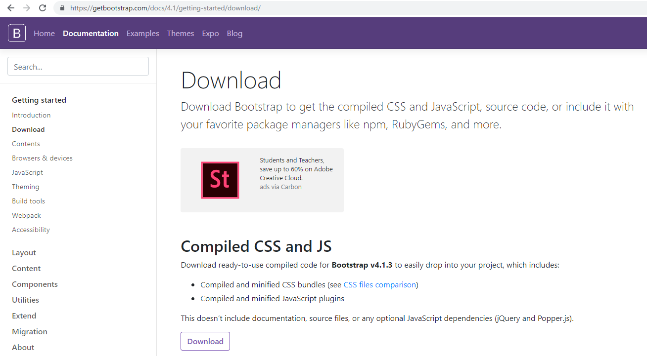
พอโหลด Bootstrap มาให้ copy มาไว้ในโปรเจค จะได้โฟลเดอร์ css กับ js มีไฟล์ด้านในประมาณนี้
bootstarp grid จะมีเฉาะเรื่อง grid และ layout
bootstrap reboot จะมีฟังชันก์ใหม่ ตัวที่ยังไม่ใช่ production จริง
bootstarp.css จะเป็นแบบโค้ดสวยๆ อ่านได้
bootstarp.min.css จะทำ minify มาแล้ว ตัด space และ ขึ้นบรรทัดใหม่ ทำให้ไฟล์เล็กลง

เวลาจะใช้งานจริง เราจะใช้ bootstrap.min.css ในการทำงาน
<link rel="stylesheet" href="css/bootstrap.min.css"/>
การจัด Layout แบบ GRID
ใน bootstrap จะใช้ระบบ GRID ในการวาง layout ต่างๆ
เริ่มจากใช้ div ที่มี class ชื่อว่า container
<!DOCTYPE html>
<html lang="en">
<head>
    <meta charset="UTF-8">
    <meta name="viewport" content="width=device-width, initial-scale=1.0">
    <meta http-equiv="X-UA-Compatible" content="ie=edge">
    <title>Hello</title>
    <link rel="stylesheet" href="css/bootstrap.min.css"/>
</head>
<body>
    <div class="container">

    </div>
</body>
</html>
ด้านในจะมี div ย่อย แบ่งเป็น row col คล้ายกับตาราง
แนะนำเขียน comment เอาไว้ ซึ่งใน HTML จะใช้ <!– –>
<body>
    <div class="container">
        <div class="row">
            <div class="col">

            </div> <!-- Close col 1.1 -->
        </div> <!-- Close row 1 -->
    </div> <!-- Close container -->
</body>
class container จะทำให้มีพื้นที่ว่างด้านข้าง และเปลี่ยน Font เป็น Helvetica Neue

เพื่อนของมันอีกตัวคือ container-fluid มันจะขายเต็มจอ
<div class="container-fluid">

มาลองเล่นเรื่องรูปภาพกันบ้าง
เพิ่มรูปภาพใน grid col คือใช้ <img>
<body>
    <div class="container">
        <div class="row">
            <h1>Hello World</h1>
        </div>
        <div class="row">
            <div class="col>
                <img src="img/banner/banner2.jpg">
            </div>
        </div>
    </div>
</body>
ลองเลือกรูปภาพใหญ่ๆ เมื่อเปิดดูจะเห็นว่ารูปภาพมีขนาดใหญ่จนล้นจอ ยิ่งเปิดในมือถือก็ยิ่งล้น มันไม่ responsive
วิธีแก้คือ เพิ่ม class ชื่อว่า img-fluid
<img src="img/banner/banner2.jpg" class="img-fluid">
รูปภาพจะปรับ scale อัตโนมัติ

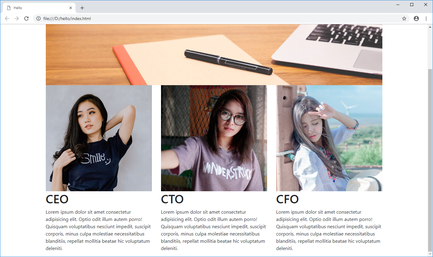
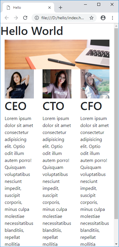
ลองเพิ่ม col 3 อัน มันจะแบ่งหน้าจอให้เท่ากัน เป็น 3 ส่วน
<body>
    <div class="container">
        <div class="row">
            <h1>Hello World</h1>
        </div> <!-- Close Row 1 -->
        <div class="row">
            <div class="col">
                <img src="img/banner/banner2.jpg" class="img-fluid">
            </div>
        </div> <!-- Close Row 2 -->
        <div class="row">
            <div class="col">
                <img src="img/staffs/staff1.jpg" class="img-fluid" />
                <h1>CEO</h1>
                <p>Lorem ipsum dolor sit amet consectetur adipisicing elit. Optio odit illum autem porro! Quisquam
                    voluptatibus nesciunt impedit, suscipit corporis, minus culpa molestiae necessitatibus blanditiis,
                    repellat mollitia beatae hic voluptatum deleniti.</p>
            </div>
            <div class="col">
                <img src="img/staffs/staff2.jpg" class="img-fluid" />
                <h1>CTO</h1>
                <p>Lorem ipsum dolor sit amet consectetur adipisicing elit. Optio odit illum autem porro! Quisquam
                    voluptatibus nesciunt impedit, suscipit corporis, minus culpa molestiae necessitatibus blanditiis,
                    repellat mollitia beatae hic voluptatum deleniti.</p>
            </div>
            <div class="col">
                <img src="img/staffs/staff3.jpg" class="img-fluid" />
                <h1>CFO</h1>
                <p>Lorem ipsum dolor sit amet consectetur adipisicing elit. Optio odit illum autem porro! Quisquam
                    voluptatibus nesciunt impedit, suscipit corporis, minus culpa molestiae necessitatibus blanditiis,
                    repellat mollitia beatae hic voluptatum deleniti.</p>
            </div>
        </div> <!-- Close Row 3 -->
    </div> <!-- Close container -->
</body>
1 แถวของ Bootstrap มี 12 หน่วย ถ้าเกินมันจะล่วงลงมาแถวใหม่ ถ้าใส่ไม่ถึง 12 มันจะมีช่องว่างที่เหลืออยู่
วิธีการคือ ใช้คลาส col- ตามด้วยหน่วย เช่น ต้องการให้คอลัมภ์แรก 50% ของแถว อีกสองอันก็แบ่งอันละ 25%
        <div class="row">
            <div class="col-6">
                <img src="img/staffs/staff1.jpg" class="img-fluid" />
                <h1>CEO</h1>
                <p>Lorem ipsum dolor sit amet consectetur adipisicing elit. Optio odit illum autem porro! Quisquam
                    voluptatibus nesciunt impedit, suscipit corporis, minus culpa molestiae necessitatibus blanditiis,
                    repellat mollitia beatae hic voluptatum deleniti.</p>
            </div>
            <div class="col-3">
                <img src="img/staffs/staff2.jpg" class="img-fluid" />
                <h1>CTO</h1>
                <p>Lorem ipsum dolor sit amet consectetur adipisicing elit. Optio odit illum autem porro! Quisquam
                    voluptatibus nesciunt impedit, suscipit corporis, minus culpa molestiae necessitatibus blanditiis,
                    repellat mollitia beatae hic voluptatum deleniti.</p>
            </div>
            <div class="col-3">
                <img src="img/staffs/staff3.jpg" class="img-fluid" />
                <h1>CFO</h1>
                <p>Lorem ipsum dolor sit amet consectetur adipisicing elit. Optio odit illum autem porro! Quisquam
                    voluptatibus nesciunt impedit, suscipit corporis, minus culpa molestiae necessitatibus blanditiis,
                    repellat mollitia beatae hic voluptatum deleniti.</p>
            </div>
        </div>

ทีนี้ลองมาดูปัญหาเมื่อเปิดในจอของโทรศัพท์ คอลัมภ์สามอันมันดูอึดอัด การดูในมือถือมันควรจะแสดงทีละอัน มันยังไม่ responsive
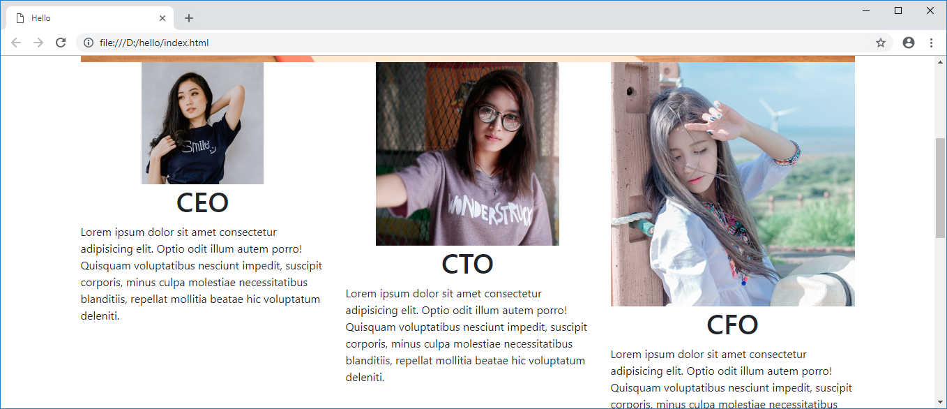
วิธีการคือใช้ Grid option เช่น col-md-4 หมายถึง ถ้าหน้าจอมีขนาดมากกว่า Medium มันจะใช้หน่วยขนาด 4 แต่ถ้าไม่ใช่ มันจะใช้ 1 เป็นค่าเดิม ซึ่ง Medium มีหน้าจอขนาด >= 768px ซึ่งคือหน้าจอคอมนั่นเอง ดังนั้น ถ้าหน้าจอเล็กมันก็จะใช้ col-1 แทนนั่นเอง หน้าจอมือถือเลยแสดง col-1 ซึ่งคืออันเดียวเต็มจอ
        <div class="row">
            <div class="col-md-4">
                <img src="img/staffs/staff1.jpg" class="img-fluid" />
                <h1>CEO</h1>
                <p>Lorem ipsum dolor sit amet consectetur adipisicing elit. Optio odit illum autem porro! Quisquam
                    voluptatibus nesciunt impedit, suscipit corporis, minus culpa molestiae necessitatibus blanditiis,
                    repellat mollitia beatae hic voluptatum deleniti.</p>
            </div>
            <div class="col-md-4">
                <img src="img/staffs/staff2.jpg" class="img-fluid" />
                <h1>CTO</h1>
                <p>Lorem ipsum dolor sit amet consectetur adipisicing elit. Optio odit illum autem porro! Quisquam
                    voluptatibus nesciunt impedit, suscipit corporis, minus culpa molestiae necessitatibus blanditiis,
                    repellat mollitia beatae hic voluptatum deleniti.</p>
            </div>
            <div class="col-md-4">
                <img src="img/staffs/staff3.jpg" class="img-fluid" />
                <h1>CFO</h1>
                <p>Lorem ipsum dolor sit amet consectetur adipisicing elit. Optio odit illum autem porro! Quisquam
                    voluptatibus nesciunt impedit, suscipit corporis, minus culpa molestiae necessitatibus blanditiis,
                    repellat mollitia beatae hic voluptatum deleniti.</p>
            </div>
        </div> <!-- Close Row 3 -->
พอเปิดในจอเล็กมันก็แสดงเต็มจอแล้ว

ดูรายละเอียดเรื่อง Grid Option ได้ที่
https://getbootstrap.com/docs/4.0/layout/grid/
ซึ่งนอกจาก md แล้วก็มี sm , lg , xl ด้วย
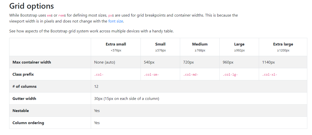
จะได้ประมาณนี้

Source code
https://gist.github.com/benznest/f365a2de60451b6696c78d5ce642e293
การจัด Format
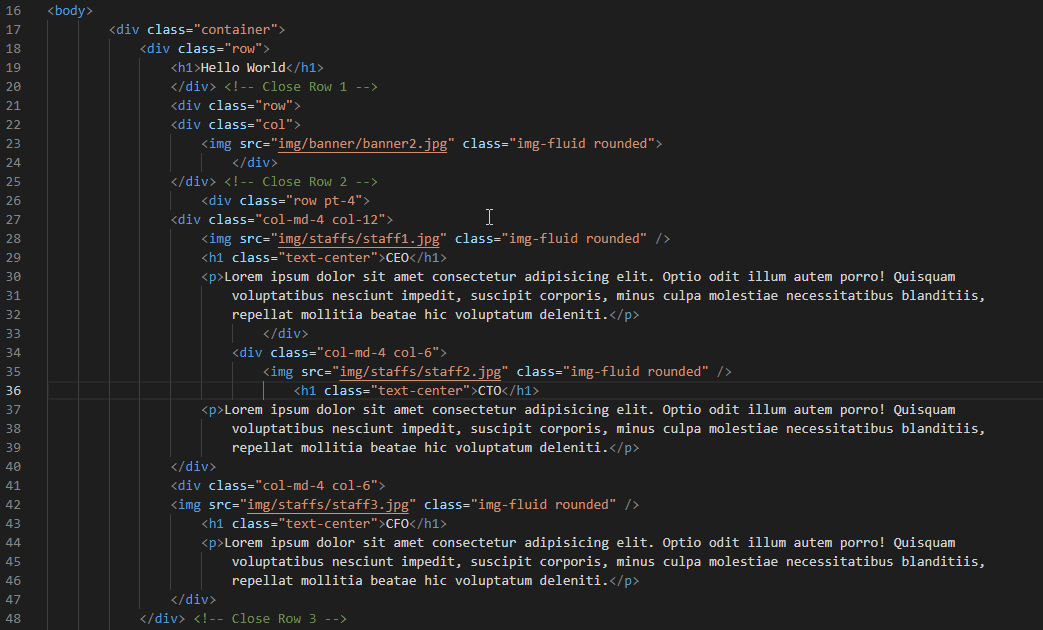
ตอนนี้ เราจะเริ่มใช้ <div> ซับซ้อนขึ้น โค้ดมันอาจจะไม่เป็นระเบียบ
วิธีการให้มันจัดระเบียบ คือ คลิกขวาเลือก Format document หรือกด Shift + Alt + F
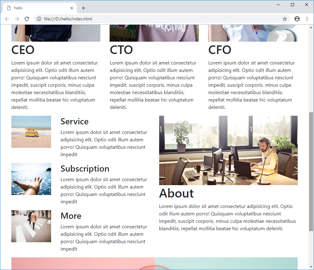
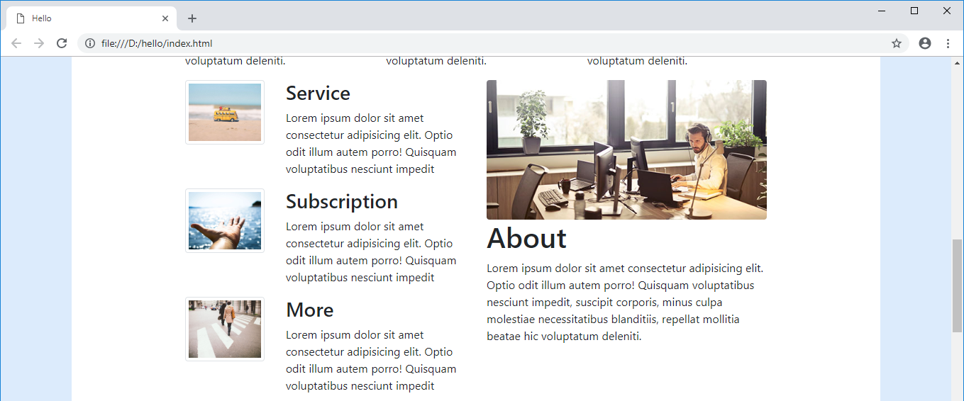
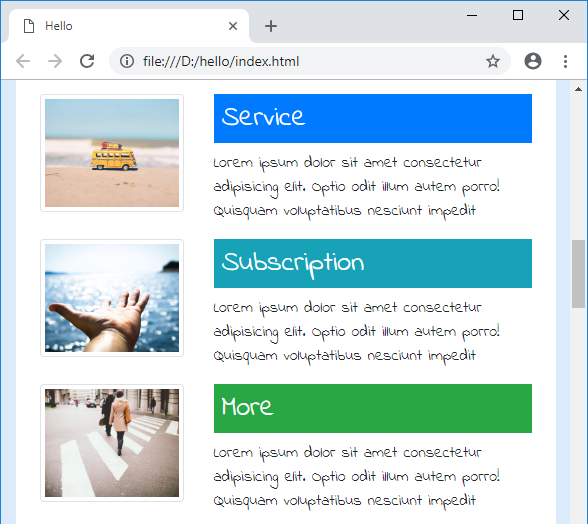
การซ้อน Grid
เราสามารถนำ Grid มาซ้อนอีกชั้นได้ โดยมันจะยังใช้หน่วย 12 เหมือนเดิม
        <!-- Start Row 4 -->
        <div class="row">
            <div class="col-md-6 col-12">
                <div class="row">
                    <div class="col-4">
                        <img src="img/life/life2.jpg" class="img-fluid" />
                    </div>
                    <div class="col-8">
                        <h3>Service</h3>
                        <p>Lorem ipsum dolor sit amet consectetur adipisicing elit. Optio odit illum autem porro!
                            Quisquam
                            voluptatibus nesciunt impedit</p>
                    </div>
                </div>
                <div class="row">
                        <div class="col-4">
                                <img src="img/life/life3.jpg" class="img-fluid" />
                            </div>
                    <div class="col-8">
                        <h3>Subscription</h3>
                        <p>Lorem ipsum dolor sit amet consectetur adipisicing elit. Optio odit illum autem porro!
                            Quisquam
                            voluptatibus nesciunt impedit</p>
                    </div>
                </div>
                <div class="row">
                        <div class="col-4">
                                <img src="img/life/life4.jpg" class="img-fluid" />
                            </div>
                    <div class="col-8">
                        <h3>More</h3>
                        <p>Lorem ipsum dolor sit amet consectetur adipisicing elit. Optio odit illum autem porro!
                            Quisquam
                            voluptatibus nesciunt impedit</p>
                    </div>
                </div>
            </div>
            <div class="col-md-6 col-12">
                <img src="img/content/office12.jpg" class="img-fluid" />
                <h1>About</h1>
                <p>Lorem ipsum dolor sit amet consectetur adipisicing elit. Optio odit illum autem porro! Quisquam
                    voluptatibus nesciunt impedit, suscipit corporis, minus culpa molestiae necessitatibus blanditiis,
                    repellat mollitia beatae hic voluptatum deleniti.</p>
            </div>
        </div>
        <!-- Close Row 4 -->
Source code
https://gist.github.com/benznest/5c13cf8292c68a89183103233f53f7bd
Class ของรูปภาพ
เพิ่มความสวยงามให้กับรูปภาพ ด้วย class ชื่อว่า rounded รุปภาพจะมีขอบมน
<img src="img/life/life4.jpg" class="img-fluid rounded" />

หรือจะใช้ class ชื่อว่า rounded-circle ทำให้รูปเป็นวงกลม
<img src="img/life/life4.jpg" class="img-fluid rounded-circle" />

อีกอัน คือ class ชื่อว่า img-thumbnail ทำให้รูปมีขอบเป็นเส้นด้านนอก
<img src="img/life/life4.jpg" class="img-fluid img-thumbnail" />

Class ของ Width
มี class ของ bootstrap ที่ใช้บ่อย เช่น การกำหนด width %
เช่น w-50 คือกำหนด ให้มีขนาด 50% และการกำหนด mx-auto d-block คือการกำหนดตรงกลาง
<img src="img/staffs/staff1.jpg" class="w-50 mx-auto d-block" />
<h1 class="text-center">CEO</h1>
class เพื่อนๆในแก็งนี้ก็มี w-25 , w-50 , w-75 , w-100
<img src="img/staffs/staff1.jpg" class="w-50" />
<img src="img/staffs/staff2.jpg" class="w-75" />
<img src="img/staffs/staff3.jpg" class="w-100" />

การ Custom Bootstrap
เวลาเราจะเพิ่ม css ของเราและต้องการทับกับ bootstrap ให้ไปเขียนที่ custom.css
เช่น ต้องเปลี่ยนสีพื้นหลัง ของ class container ซึ่ง container เป็นของ bootstrap
body{
    background: #DCEBFC;
}
.container{
    background: #FFF;
}
แล้วก็เวลาเรียกใน HTML ให้ใส่ทีหลัง bootstrap.css นะ เพราะมันจะได้อ่านทับ bootstrap แล้วนั่นเอง
<head>
    ...
    <link rel="stylesheet" href="css/bootstrap.min.css" />
    <link rel="stylesheet" href="css/custom.css" />
</head>

หน่วย rem
rem คือ root element มันคือการกำหนด font-size ที่ root แล้วเอามาคูณ เช่น ถ้ากำหนด font-size 10 px
2 rem = 16×2 = 32 px นั่นเอง
ใน Bootstrap จะใช้ font-size = 16 px ดังนั้น 1 rem = 16 px
ลองกำหนด padding ของ container 4.5rem = 16×4.5 = 72px
body{
    background: #DCEBFC;
}
.container{
    background: #FFF;
    padding: 4.5rem
}
การ custom ค่า font-size ไม่ใช้ของ bootstrap ต้องไปเซ็ตใน html ที่เป็น root element
html{
    font-size:8px;
}
ค่า rem ก็จะเปลี่ยนมาใช้ font-size ของเราแทน
body{
    background: #DCEBFC;
}
.container{
    background: #FFF;
    padding: 10rem
}
h1,h2,h3{
    color:#4F85D7;
}

Class สำหรับ Margin – Padding – Border
เราสามารถใช้ rem มาใช้กับ class Margin Padding ได้
margin คือระยะห่างจาก element นี้กับอันอื่น
padding คือระยะห่างจากเนื้อหาถึงขอบ
border คือ ขนาดขอบ
วิธีการคือ {boxmodel}{position}-{rem}
margin-top 3 rem = mt-3
padding 5 rem = p-5
margin 2 rem = m-2
padding-bottom 3 rem= pd-3
ลองกำหนด padding-top 4 rem ซึ่งมีขนาด 16×4 = 64 px
<div class="row pt-4">
   ...

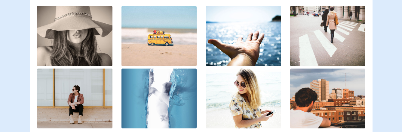
ซึ่ง class margin padding ใช้บ่อยมากๆ
        <div class="row">
                <div class="col-3 mt-2">
                    <img src="img/life/life.jpg" class="img-fluid  rounded" />
                </div>
                <div class="col-3 mt-2">
                    <img src="img/life/life2.jpg" class="img-fluid  rounded" />
                </div>
                <div class="col-3 mt-2">
                    <img src="img/life/life3.jpg" class="img-fluid  rounded" />
                </div>
                <div class="col-3 mt-2">
                    <img src="img/life/life4.jpg" class="img-fluid  rounded" />
                </div>
                <div class="col-3 mt-2">
                    <img src="img/life/life5.jpg" class="img-fluid  rounded" />
                </div>
                <div class="col-3 mt-2">
                    <img src="img/life/life6.jpg" class="img-fluid  rounded" />
                </div>
                <div class="col-3 mt-2">
                    <img src="img/life/life7.jpg" class="img-fluid  rounded" />
                </div>
                <div class="col-3 mt-2">
                    <img src="img/life/life8.jpg" class="img-fluid  rounded" />
                </div>
        </div> <!-- Close Row 5 -->
Custom font
มาลองเปลี่ยน font ให้กับเว็บกัน
เข้าไปดาวน์โหลด font ที่ Google Font
เลือกอันที่ชอบ กด +

มันจะมีแถบด้านล่าง กดขึ้นมาเลือกแท็บ IMPORT แล้ว copy โค้ด @import

เอาไปวางใน custom.css ของเรา
จากนั้นอยากใช้ font ตรงไหนก็เอา font-family ไปวางไว้ เช่นใส่ทั้งหน้าเลยก็ใส่ที่ body
@import url('https://fonts.googleapis.com/css?family=Indie+Flower');
body{
    background: #DCEBFC;
    font-family: 'Indie Flower', cursive;
}
.container{
    background: #FFF;
    padding: 1.5rem
}
h1,h2,h3{
    color:#4F85D7;
}

ทำ Footer
ลองเพิ่ม class ของเราเองชื่อ footer
เนื้อหาใส่เป็นคำคม เพื่อลองใช้ font อีกตัว
        <div class="row footer p-5">
                <div class="col-12">
                    <h2 class="text-center">Nothing in life is to be feared,
                            it is only to be understood.
                            Now is the time to understand more,
                            so that we may fear less.</h2>
                </div>
        </div>
ก็ทำเหมือนเดิม คือเพิ่มตรง @import
แล้วก็ใส่ font-family ที่ footer
@import url('https://fonts.googleapis.com/css?family=Dancing+Script|Indie+Flower');
body{
    background: #DCEBFC;
    font-family: 'Indie Flower', cursive;
}
.container{
    background: #FFF;
    padding: 1.5rem
}
h1,h2,h3{
    color:#4F85D7;
}
.footer{
    font-family: 'Dancing Script', cursive;
}

Source code
https://gist.github.com/benznest/21a5a7f2acbce4815433cd77f91c0b8e
Fontawesome
fontawesome คือ ไลบรารี่เกี่ยวกับ icon ซึ่ง Bootstrap 4 ไม่มี fontawesome ติดมาอีกแล้ว เนื่องจาก fontawesome ไม่มีฟรี
https://fontawesome.com/how-to-use/on-the-web/setup/getting-started?using=web-fonts-with-css
copy link CDN ของ Fontawesome เข้ามา
    <link rel="stylesheet" href="css/bootstrap.min.css" />
    <link rel="stylesheet" href="https://use.fontawesome.com/releases/v5.5.0/css/all.css"
          integrity="sha384-B4dIYHKNBt8Bc12p+WXckhzcICo0wtJAoU8YZTY5qE0Id1GSseTk6S+L3BlXeVIU" crossorigin="anonymous">
    <link rel="stylesheet" href="css/custom.css" />
ในเว็บ Fontawesome ก็เลือก icon ที่ชอบ พอกดเข้าไปมันจะมีโค้ดอยู่

ให้นำโค้ด มาใช้ โดย <i> คือ icon มันต้องอยู่ภายใต้แท็กอื่นๆ
<h2 class="text-center">
<i class="far fa-kiss-wink-heart"></i>
                        Nothing in life is to be feared,
                        it is only to be understood.
                        Now is the time to understand more,
                        so that we may fear less.</h2>
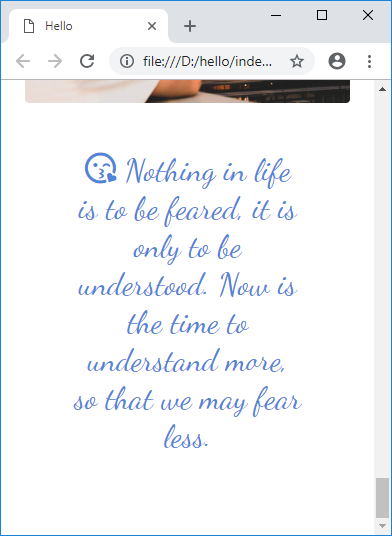
เราสามารถนำ <span> มาใช้ได้เพื่อกำหนดขนาดของมัน
เช่น custom.css กำหนดขนาดของ icon ที่ 10rem
.front-icon{
    display:block;
}

.front-icon i{
    font-size: 10rem;
}
ใน html ก็เอา span มาครอบ
        <div class="row">
            <div class="col-12">
                <span class="front-icon text-center">
                    <i class="far fa-kiss-wink-heart"></i>
                </span>
            </div>
        </div> <!-- Close Row 7 -->
icon จะมีขนาด 10rem แล้ว

หรือจะใช้พื้นหลังสีอื่น ไอคอนสีขาว
.front-icon{
    display:block;
    color:#FFFFFF;
    padding:3rem;
    background:#4F85D7;
}

.front-icon i{
    font-size: 10rem;
}

Class ของสี
class utilities ที่ใช้บ่อยอีกตัวคือ เกี่ยวกับสี
อ่านได้ที่ https://getbootstrap.com/docs/4.0/utilities/colors/
หลักๆคือ มีให้เลือกใช้ดังนี้
primary
danger
success
info
dark
light
ใช้กับ class พวก bg- , text-
เช่น
<h3 class="bg-primary p-2 text-white">Service</h3>
วิธี Custom
เช่นอยากเปลี่ยนสีให้ต่างจาก bootstrap ให้ใส่ !important ด้วย
.bg-primary{
    background: #4F85D7 !important;
}
การใช้ Animate.css
เข้าไปดาวน์โหลด css ได้ที่
https://daneden.github.io/animate.css/
แล้วเพิ่มเข้ามาใน HTML ของเรา
<link rel="stylesheet" href="css/animate.css" />
วิธีการเรียกใช้ ก็แค่ใช้ class
animated = เรียกใช้ animated
infinite = ทำไปเรื่อยๆ
pulse = Animation แบบ pulse
delay-1s = delay 1 วินาที
<h2 class="text-center animated infinite pulse delay-1s"><i class="far fa-kiss-wink-heart"></i>
                    Nothing in life is to be feared,
                    it is only to be understood.
                    Now is the time to understand more,
                    so that we may fear less.</h2>

Source code
https://gist.github.com/benznest/ad45fd26b773e1ff47bb9727a4702494
สรุป
บทความนี้ก็สรุปคร่าวๆเกี่ยวกับการใช้ bootstrap ที่เป็นเรื่องสำคัญๆ เช่นการใช้ grid จัดวาง layout การทำให้รองรับ responsive การใช้ utility class เช่น margin padding รวมถึงพวกสี เช่น primary danger ที่เจอบ่อยมาก แล้วก็แนะนำเกี่ยวกับหน่วย rem ด้วย แถมด้วยเปลี่ยน Font กับใส่ Icon
ตอนหน้าจะเป็นเรื่องของการใช้ component อื่นๆที่ใช้งานบ่อยๆ รวมถึงเทคนิคเกี่ยวกับ bootstrap เพิ่มเติมด้วย
 Next Post